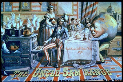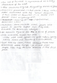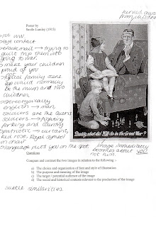


Furthermore, the two adverts are trying to sell some form of dream. Lumley’s title reads ‘Daddy, what did YOU do in the Great War?’ The image is selling the dream of becoming a war of hero and your children, future generations, being proud of you. The typeface choice gives the impression that it could have been hand written. This may be referring to the letters fighting soldiers received from home or enhancing the idea that it is a child asking the question. Either way it adds a personal feeling to the advertisement persuading onlookers to become a part of the dream. The fact that ‘you’ is in upper case and underlined immediately makes it all about the viewer, not the man in the image. Also, Lumley could have said ‘World War’ instead of ‘Great War’. However, ‘Great War’ glorifies war, making it sound wonderful, something it certainly was not.
Similarly, Schumacher & Ettlinger’s advert portrays the idea of the ‘American dream’. With lavish furnishings, servants, this is clearly upper class, advertising a better, richer way of living. The ‘Wild West’ style font also expresses the ‘American dream’. The Wild West symbolises gold rushes, going into the desert and building a new civilisation. Revealing to people ‘the dream’ is a powerful method of persuasion. In both adverts it immediately makes viewers want to live that dream and become that hero, but unless they do what the adverts tell them they cannot have it.
Finally, both adverts are aimed at the middle classes. Schumacher & Ettlinger’s image promotes the upper class society and how you can achieve this lifestyle if you buy their cookers. The lower classes would not be able to afford a cooker and the dream is unachievable for them. Yet, the middle class people are likely to be able to afford this cooker, become upper class and achieve the ultimate American lifestyle. It is similar to Lumley’s advert. However, upper class society is not being attracted in this advert; they would not have gone to war, but would have paid to stay safe in the countryside. On the other end of the spectrum, the lower classes would already be at war as a soldier’s pay would be higher then their previous jobs. Therefore middle class society was the target audience. The middle class would not have been so well off as to escape to the county but could probably afford to stay home with their current jobs, avoiding the risk of going to battle.
In conclusion, both advertisements have used patriotic symbolism as a way of persuading their audiences. Throughout this essay I have discovered that subtle qualities such as the use of colour, typeface and symbolism are powerful methods of visual persuasion. Still more important is to use design to target audience and capture aspirations.


No comments:
Post a Comment